You’ve heard it before, especially if you regularly read or listen to The Best Interest:
- Stocks are volatile in the short run and rewarding in the long run
- Bonds are less volatile (good) but less rewarding (bad)
It’s a perfect example of investing’s golden relationship between risk and reward.
The two charts we’ll look at today wonderfully present stock and bond behavior. First, let’s baseline ourselves in bonds.
The chart below shows bond data (the Bloomberg U.S. Aggregate bond index) from 1976 through 2022. The gray bars show full calendar year returns in the bond index. The red dots, however, show the largest intra-year decline (“peak to trough”) each year. For example, let’s look at 1997. The bond index finished the year up 10%. But the index was down 2% from its previous high at one point during the year.
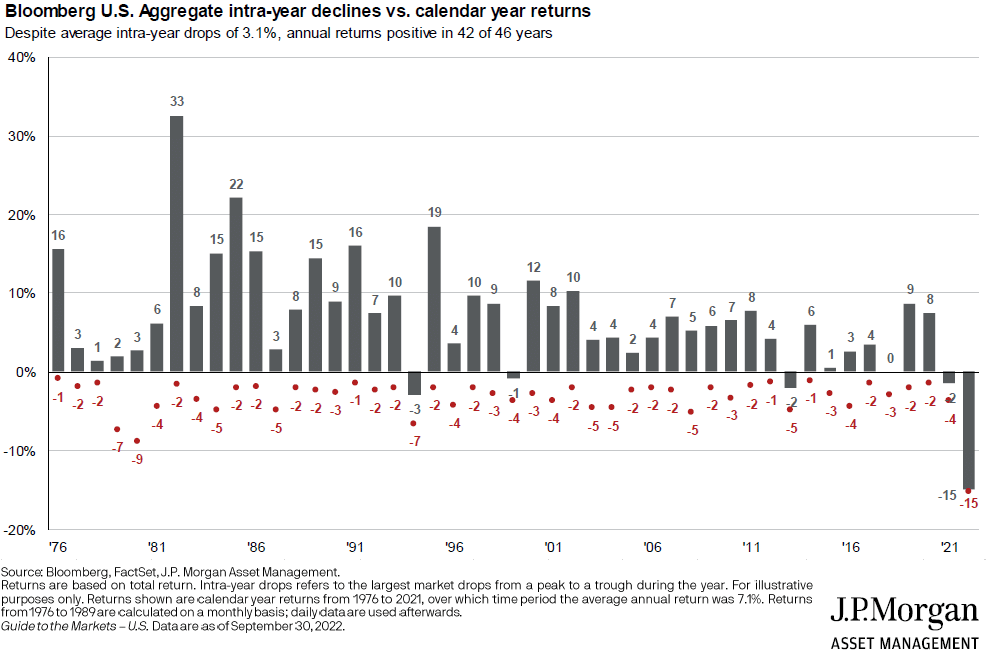
Most years have had single-digit returns – the average is +6.6%. And the average intra-year decline has been (-3.4%). 2022 is quite the outlier.
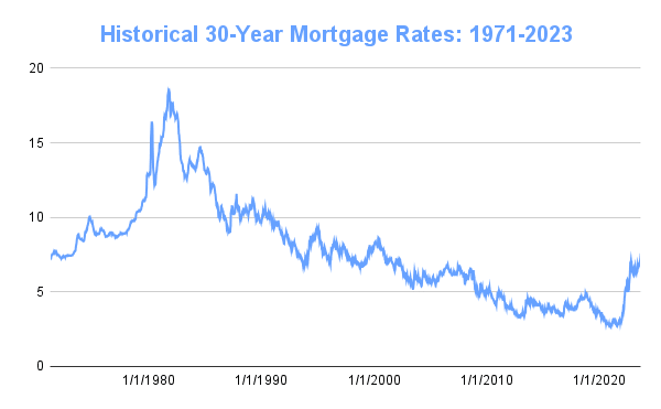
For what it’s worth, this data set syncs up pretty closely with the last ~40 years of declining interest rates (see below). As rates fall, the values of existing bonds increase. When rates rise, the values of existing bonds decrease (see 2022). Multiple decades of steady interest rate declines (e.g. 1980 to 2021) lead to multiple decades of positive bond returns. The future might not be so steady.
Stock data looks much choppier than bond data. The chart below again shows annual returns (in gray bars) against intra-year draw downs (red dots), but this time for the S&P 500 stock index.
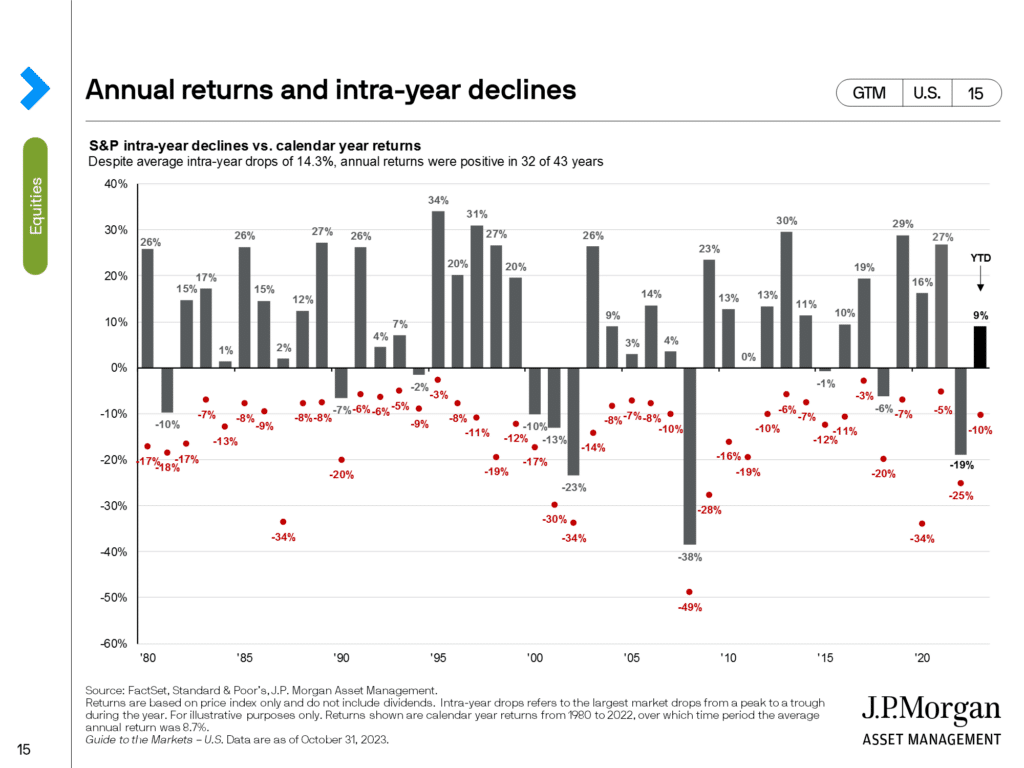
The average annual return is +8.6%. But the average intra-year decline is (-14.3%)!
**Important note – JP Morgan does not include dividends in this chart, which I think is a mistake. Including those dividends, the average annual return is more like ~11% during this period, while the intra-year decline would remain the same.
A year like 2003 serves as a perfect example. Down (-14%) at one point during the year. That feels pretty bad. Yet, at year-end, the S&P was up +26%. Amazing!
Stocks provided significantly better returns than bonds over this period. In total, stocks returned ~6500% (65x), whereas bonds returned ~2000% (20x). A triple-up win for stocks.
But at what cost? Stocks saw an average of (-14.3%) annual drawdowns. That’s roughly the same as bonds’ worst year (-15%).
And stocks had 5 unique annual drawdowns of 30% or more. To put that in dollar terms, 30% of a $500K stock allocation is $150,000. Imagine, once per decade, watching $500K become $350K?!
Granted, investors would be utterly unharmed if they followed conventional wisdom and stayed the course. But that’s much harder done than said. As we’ve discussed countless times, it’s one thing to say, “Stay the course when you’re down $150,000”…and it’s another thing to actually do it.
Our brains hate hanging on for dear life, so we’re tempted to cut bait and “sell to survive.” Literally. Selling our wounded stock position so our mental health can survive. It’s logical human behavior. And terrible investor behavior.

So like a broken record player, we revolve back around to topics like diversification, goals-based investing, etc. Today’s data show why most investors should own stocks and bonds (and possibly other uncorrelated assets). Some assets to grow (even if volatile), and other assets to provide stable near-term spending.
That brings us to the final chart: the same presentation as before, but now for a 60% stock, 40% bond portfolio (through 2022). And, in this chart, JP Morgan does assume dividends in the stock portion of the portfolio.
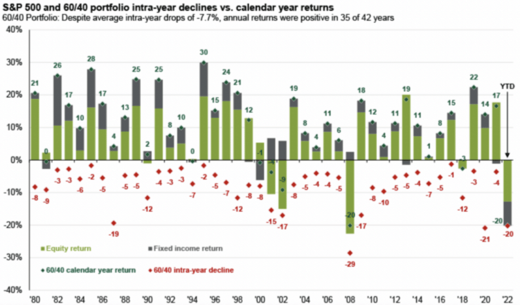
This 60/40 data shows an average annual return of +9.9%, and an average drawdown of (-7.7%). Solid returns and not too much pain along the way. Maybe there’s something to this diversification after all?
In summary:
- S&P 500: Average return of ~11.0% per year (including dividends), with average drawdown of (-14.3%)
- Bond Aggregate Index: Average return of ~6.6% per year (including interest), with average drawdown of (-3.4%)
- 60/40 Portfolio: Average return of 9.9% per year (including dividends), with average drawdown of (-7.7%)
I hope your drawdowns are small, swift, and occur only when you’re not paying attention. But don’t bet your portfolio on it!
Thank you for reading! Here are three quick notes for you:
First – If you enjoyed this article, join 1000’s of subscribers who read Jesse’s free weekly email, where he send you links to the smartest financial content I find online every week. 100% free, unsubscribe anytime.
Second – Jesse’s podcast “Personal Finance for Long-Term Investors” has grown ~10x over the past couple years, now helping ~10,000 people per month. Tune in and check it out.
Last – Jesse works full-time for a fiduciary wealth management firm in Upstate NY. Jesse and his colleagues help families solve the expensive problems he writes and podcasts about. Schedule a free call with Jesse to see if you’re a good fit for his practice.
We’ll talk to you soon!
I am always surprised to read that a 60/40 portfolio could outperform a S&P 500 portfolio with less volatility. I believe I also read this in your book. So, investing in a Vanguard or similar 60/40 fund or ETF seems to be the way to go?
Hey Janis – over the long run, 60/40 won’t outperform 100% S&P.
But when you account for volatility, the 60/40 might be way easier to stomach.
Yep – an easy to implement example would be something like VBIAX: Vanguard Balanced Index Fund Admiral Shares.