Actual stock market returns are not the same as average stock market returns.
But first, just imagine if a pilot said this on your next flight…
Hey folks, this is your Captain speaking from the flight deck.
We’ll be taking off momentarily. And eventually, we’ll have a smooth touchdown in your final destination.
In between, we’ll have periods of smooth flight. The attendants will be passing out champagne and chocolates.
But we’ll have a couple periods where I, uhh, inadvertently lose control of the plane. We’ll uhhh enter a nose dive for a bit, and everyone will be screaming.
But don’t worry – if you average out the exuberant champagne high with the sheer terror of almost crashing into the side of a mountain, we’re gonna have a smooth flight. Thanks, enjoy, and we appreciate you flying with Best Interest Airlines.
Sure, it’s a joke. No flight is like that. But this joke, my friends, is just like the real stock market.
Average Flight vs. Actual Flight
The average flight is smooth as butter. Take off, ascend, cruise, descend, land. Short-term turbulence doesn’t show up in the average. The average only cares about where you start and where you end. But that “smooth average” means nothing to the guy losing his lunch from turbulence. This is the perfect example of ergodicity.
The act of averaging smooths rough data. The average experience does not equate to actual experience. The map is not the territory.
Average Stock Market Returns vs. Actual Stock Market Returns
Historic average S&P 500 returns are 10% per year, including dividend reinvestment. Once adjusted for inflation, that number drops to 7%. That’s why advisors and experts and content creators (including me) use the average 7% per year shorthand when explaining the stock market to new investors.
Here’s what that 7% average return looks like when investing $5,000 per year for 30 years.
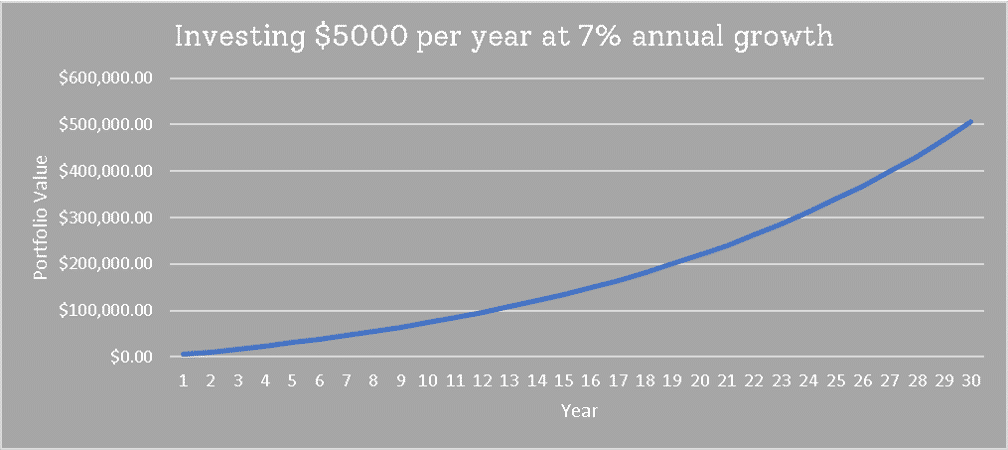
But 7% is never guaranteed. Reward only comes from risk. And there’s no risk in a guarantee. If the risk of losing money is high, then investors will demand a higher reward. Using a “guaranteed” 7% return is antithetical to this intrinsic risk-reward relationship. Actual stock market returns never look this smooth.
There is one guaranteed reward in investing. It’s called “the risk-free rate,” and it comes from U.S. Treasury bonds. It’s currently only ~1.2% per year. The idea of “repeatable and constant” actual stock market returns…it’s a false premise. It negates the entire argument. As the British say, “If my auntie had bollocks, she’d be my uncle.”
Instead, it’s more accurate and more educational to use real actual stock market returns data. Why? Because it shows how stock market investing is not a smooth flight.
Let’s recreate the smooth 7% chart above, but using actual stock market returns data. Our example will look at a 2021 retiree who has been investing $5,000 per year into the S&P 500 since 1991. His portfolio over the past 30 years looks like this:
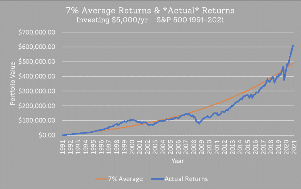
Our investor did well during to Dot Com boom of the 90s, outpacing the 7% Average “target.” But when the Dot Com bubble burst (2000 – 2002), we see his portfolio revert towards the Average plot.
The Actual portfolio progressed on pace with the Average from 2003 to 2007, but then disaster struck. Our investor’s portfolio got cut in half during the Great Financial Crisis. Everyone on the plane was screaming in terror. Does the pilot’s promise of, “This should smooth out before landing!” ease fears during this freefall? I doubt it.
As mentioned last week, we’ve been in a bull run since 2009. We can see it in the chart above. By ~2018, our investor had finally recouped his losses from the GFC and surpassed the smooth 7% average portfolio. And since the COVID-19 dip—boom!—his portfolio has rocketed up to an 8.2% annualized (i.e. “average per year”) return over the past 30 years.
8.2% per year for our actual stock market returns…that’s great! But the ride there was anything but smooth.
Annualized Actual Stock Market Returns
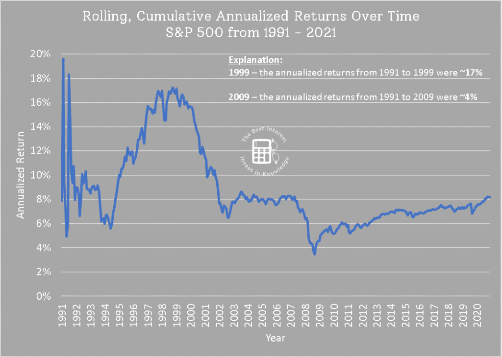
Speaking of annualized returns, I love this next chart. It shows the rolling annualized returns over the 1991 – 2021 period. How to read the chart: the annualized return from 1991 to 1999 was ~16.5%. Hence, the plot equals 16.5% for X = 1999.
Hence, the plot equals 16.5% for X = 1999.
Imagine you’re in 2009 or 2010. You’ve been told constantly, “The stock market returns 7% per year on average.” But your portfolio just got sliced in half. You only have ~4% average annual returns after investing for ~18 years!!!
Your total return “should” be ~238% (1.07 ^ 18).
But your actual return is only ~103% (1.04 ^ 18).
This is where actual stock market returns once again diverge from the average.
If you’re that person in 2009, then the idea of “average returns are 7%” DOES NOT MATTER to you. You’re frustrated and uncertain and scared about the fact that you’ve only received 4% returns. You’re 60% of the way to retirement and well short of your retirement needs! Time is running out!!!
This is reality, folks. These are actual stock market returns.
Averages help us explain the math. Averages help us get quick answers.
But actual stock market returns data explains why people fear investing. Why they sell when they shouldn’t. Why they get angry at Wall Street.
My job and your job is to understand the real data, understand that fear, and use knowledge to overcome those fears. Average data glosses over this entire idea. Average data is incomplete.
P.S. – some people asked for the same data as above, but shown for *other* 30 year periods.
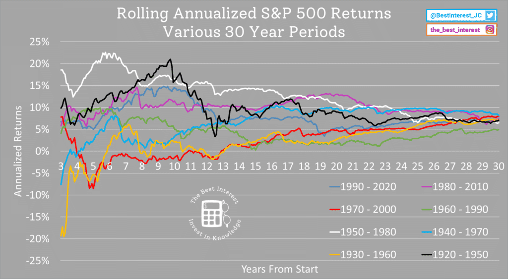
I cut off the first 3 years of data because it’s noisy when annualized. Just look at the first few years of the original chart to see what I mean.
This data is cool. Some periods start hot (1950 – 1980 in white, or 1920 – 1950 in black). Others are cold (1930 – 1960 in yellow, 1970 – 2000 in red). But all of these 30-year periods end up paying out between 5-8% annualized returns.
That is where the 7% average metric comes from. But the ride is always bumpy, never smooth.
Average And Actual – Two Different Things
Need to quickly run some numbers? Go ahead and use 7% returns for the stock market average.
But for any rigorous work—like planning your retirement!!!—remember that the average is not the actual.
Different returns, different reactions, different results.
Thank you for reading! Here are three quick notes for you:
First – If you enjoyed this article, join 1000’s of subscribers who read Jesse’s free weekly email, where he send you links to the smartest financial content I find online every week. 100% free, unsubscribe anytime.
Second – Jesse’s podcast “Personal Finance for Long-Term Investors” has grown ~10x over the past couple years, now helping ~10,000 people per month. Tune in and check it out.
Last – Jesse works full-time for a fiduciary wealth management firm in Upstate NY. Jesse and his colleagues help families solve the expensive problems he writes and podcasts about. Schedule a free call with Jesse to see if you’re a good fit for his practice.
We’ll talk to you soon!