Don’t miss an episode of our podcast, Personal Finance for Long-Term Investors. Available on all podcast players.
Here’s the latest episode:
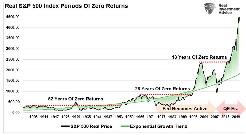
I came across this chart two weeks ago and I stopped in my tracks.
My first thought: “Whoa.”
My second thought: “Is that actually right?”
The chart is attempting to illustrate how the stock market has experienced multi-decade periods of zero return over its history.
Note: “real” (as in S&P 500 Real Price) means “after adjusting for inflation”
But I couldn’t believe that there had been a 52-year period of no real return to start the 20th century? Just imagine investing money at age 22 and seeing zero growth by the time you’re 74.
Is that really what happened?
Some Truth
The chart above is a mix of lies and truth.
Truth: there have been multi-decade periods of zero growth. I’ll show them in a corrected chart below.
Lies: this chart does not include dividends, which are one of the two principal sources of stock returns. Whether intentional or accidental, the omission of dividends means that this chart is very misleading.
So, let’s fix the mistake and show the real data.
Actual Periods of Zero Return
Here’s the real chart. It shows real returns and all dividends have been included. This is the full stock market return data. Also, the y-axis is logarithmic. This is the normal way of showing long-term investment return data. This eases comparisons across time.
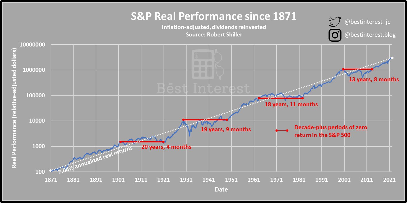
We see that there have been four distinct decade-plus periods of zero return since 1871. Three of those periods have bordered on two decades each.
We do not see the 52-year dead period shown in the original chart. Instead, we see two distinct ~20-year periods before 1905.
Nevertheless, we do see some unsettling patterns. Decade-plus periods of no return have been a repeated feature of the U.S. stock market. Ouch.
But Who Invests That Way?
If you invested in late 1999, it would take 13+ years before that investment actually gained value.
But most investors didn’t invest one lump sum in 1999 and then wait.
Instead, most investors slowly add to their positions over time. They spread out their investments. This is commonly called dollar-cost averaging.
What if an investor had dollar cost averaged during these zero-return periods? They’d buy shares of stocks throughout the time when the market was down and volatile. And ultimately, it should lead them to outperform the zero-return market.
That’s what the chart below examines.
We see investors who trickled their money into the market over 20-, 30-, and 40-year periods. The x-axis denotes the last year in a particular investing period. The y-axis denotes the annual return that the investor received.
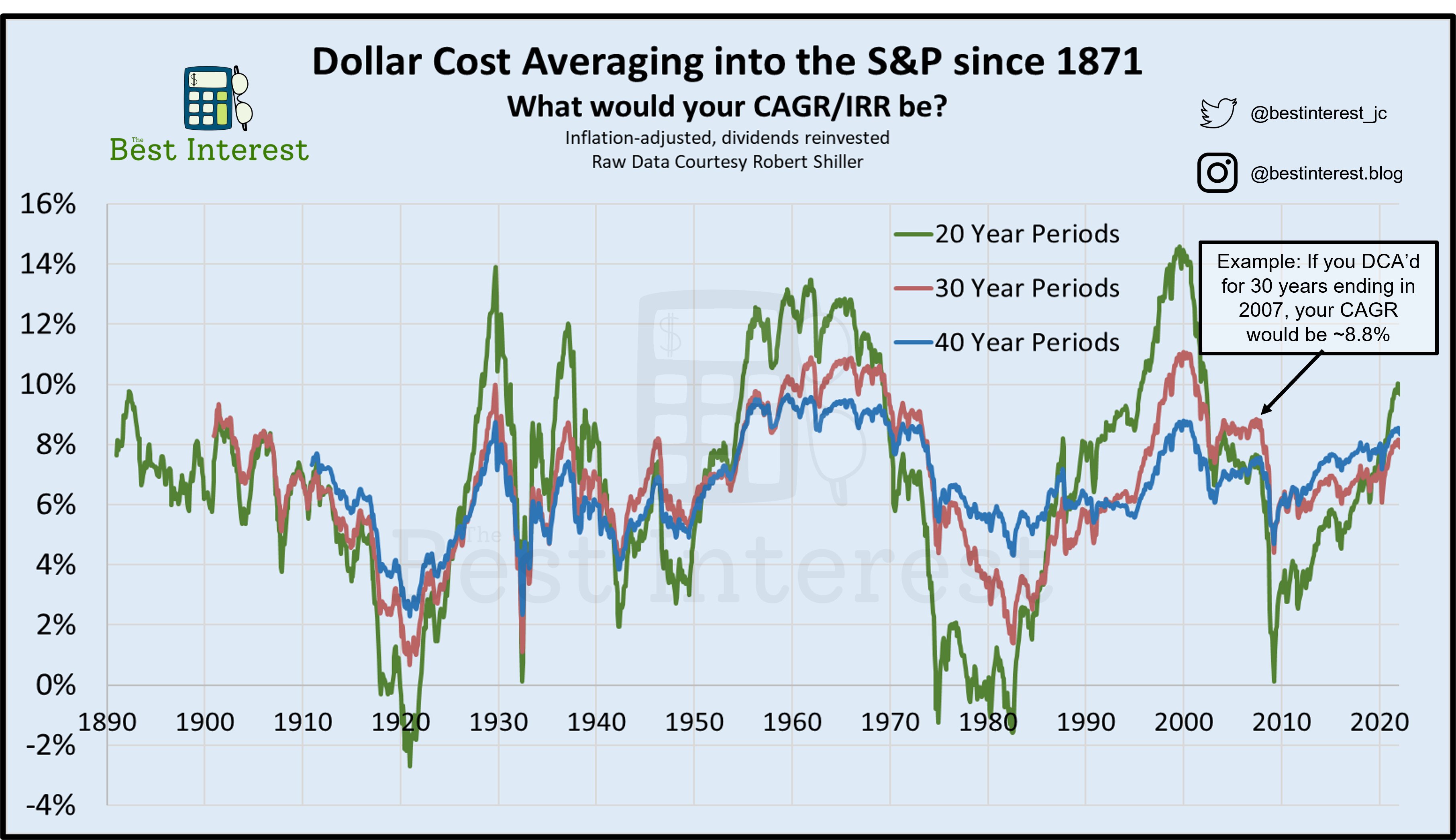
Some patterns and notes:
- Over 20-year periods (green line), we see some negative returns. This occurs when the period ends near significant crashes and recessions. In other words, an investor might have saved $100 per month for 20 years ($24,000 total), only to have less than $24,000 at the end of 20 years.
- Over 30-year periods (red line), we see no zero-return periods. We do, however, see a range of ~1% per year to ~11% per year.
- Over 40-year periods (blue line), we see even less volatility. The vast majority of 40-year periods see 5% – 9% annual returns.
Longer periods show less volatility. This is the famed “reversion to the mean” that John Bogle frequently wrote about.
I particularly like the data between 1940 and 1950. These data show an investor who experienced World War II, the Great Depression, the Great Influenza, and World War I. And yet, they received between 3% and 8% positive annual returns.
But it can be difficult to build a financial plan that works optimally under both 5% annual returns and 9% annual returns. The spread is too wide and not dependable enough.
The Zero Return Mechanism
I almost ended the article here, but I felt the need to investigate: why do zero-return decades happen? If we understand why, the phenomenon might lose its scary fangs.
The main culprits?
- Overvaluation
- Exogenous shocks
- Recessions
The early 1900s saw anti-trust legislation, the Great Influenza, and World War I.
The 1930s and 40s had the Great Depression (an overvaluation mania turned ultimate recession) and World War II.
The 1970s had runaway inflation mixed with a recession (stagflation) and an oil crisis.
And most recently, the late 90s suffered a valuation mania, then 2000s became the “lost decade” after the Great Financial Crisis.
Overvaluations, exogenous shocks, and recessions. When they hit one after the other, you might be in for a decade (or more) of pain.
So…what about the current moment?
- Has our last decade of bullishness led to overvaluation? Possibly.
- Is COVID going to be an exogenous shock that continues to ripple into the future? Possibly.
- Is the Fed raising rates going to trigger the next recession? Possibly.
Add it all up: are we on the cusp of another decade of zero returns?!?!
I don’t know. Neither do you, nor your Uncle Dave, nor your financial advisor. The future, as ever, is murky.
Further reading: We know bad things are coming, we just don’t know when.
The Period Ends
But if history is any solace, know that the bad times always end. A lost decade could start tomorrow. But it would end eventually, and another terrific bull run would start.
Let history, not fear, be your guide.
Thank you for reading! Here are three quick notes for you:
First – If you enjoyed this article, join 1000’s of subscribers who read Jesse’s free weekly email, where he send you links to the smartest financial content I find online every week. 100% free, unsubscribe anytime.
Second – Jesse’s podcast “Personal Finance for Long-Term Investors” has grown ~10x over the past couple years, now helping ~10,000 people per month. Tune in and check it out.
Last – Jesse works full-time for a fiduciary wealth management firm in Upstate NY. Jesse and his colleagues help families solve the expensive problems he writes and podcasts about. Schedule a free call with Jesse to see if you’re a good fit for his practice.
We’ll talk to you soon!
Looks pretty ominous for retirees who do invest a large amount for many years rather than DCA