The Danish physicist and Nobel prize winner Niels Bohr once said,
Prediction is very difficult. Especially if it’s about the future.
Niels Bohr
It’s a quantum physics joke! But Niels might as well be an investor. Predicting the future of the stock market is famously difficult.
I’m not much of a fortune-teller, but I do love to study the past. And if we believe that history repeats itself (or at least rhymes), then the past can be instructive of possible futures.
Today, we’ll take a look at the history of the CAPE ratio and its potential relationship to the stock market’s future returns.
What’s the CAPE Ratio?
CAPE stands for cyclically-adjusted price to earnings ratio. It’s sometimes called the Shiller P/E ratio, named after its creator, Yale’s Robert Shiller.
CAPE measures a company’s stock price against that company’s earnings over the previous 10-years. The 10-year average helps us adjust that P/E for multiple business cycles.
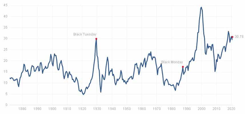
When the CAPE is high, it can be a sign that stock prices are overly exuberant compared to the economy’s underlying earnings.
And when the CAPE is low, it can be a sign that stock prices are too depressed compared to what earnings ought to rationally dictate.
Thus, we come to an important hypothesis for today’s post.
- When the CAPE is low, future stock returns will be high
- When the CAPE is high, future stock returns will be low.
- This is because extreme CAPE values are a sign of irrational investor behavior, and such irrationality cannot be maintained forever.
But does past data support this hypothesis?
If we plot past CAPE ratios against past stock market returns, will we see a pattern?
The Data
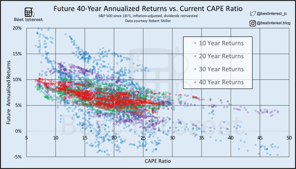
Below are four scatter plots. Each one shows a series of data comparing historical CAPE ratios against the future stock market returns (in 10-, 20-, 30-, and 40-year periods, respectively). I’ve added a bit of useful commentary after each plot.
Three details to keep in mind before we start…
- The average S&P 500 real annual return is 7%. Use that for comparison on the Y-axis of these plots.
- The average historical CAPE is 16 (median) to 17 (mean). Use that for comparison on the X-axis.
- And as of late April 2022, the CAPE ratio is 34. Use that for comparison on the X-axis.
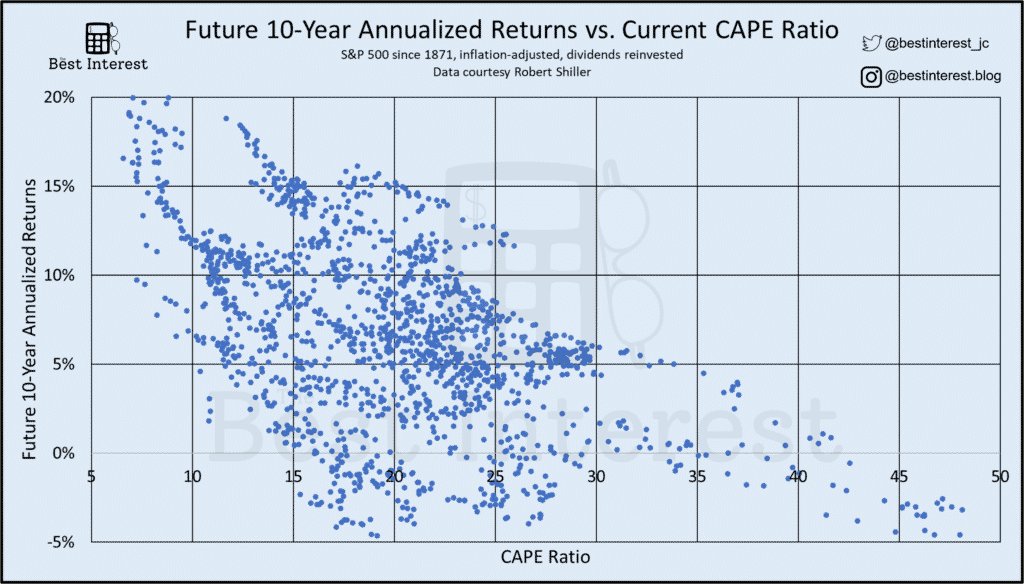
Starting with the 10-year returns, I see 3 distinct patterns.
- Low CAPEs (below 10) have typically signaled an impending 10-year period of above-average returns.
- High CAPEs (above 25) have typically signaled an impending decade of below-average returns.
- Most of the time, the CAPE falls between 15 and 25. And there’s a wide range of future returns within that CAPE domain.
Our current CAPE ratio is 34. Does that mean we’re bound for an oncoming decade of near-zero returns? Quite possibly, but not definitely.
And, importantly, some investors have serious doubts about using the CAPE ratio like this. We’ll cover those doubts later.
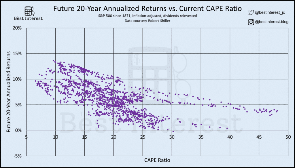
Onto the 20-year returns. The same general trend and/or slope of the data is present. Low CAPEs tend to signal high future returns, and vice versa.
But importantly, I kept the axes of the plot identical across all four plots today. You can easily see two important details about this plot as compared to the 10-year data.
First, the data is clumped more tightly. Why? We are seeing what John Bogle called the “iron rule of capital markets”…reversion to the mean! Hot markets eventually cool and cold markets eventually thaw. This is more evident over 20 years than over 10.
And the second important detail is that the “slope” of this 20-year data is flatter than the 10-year data.
Yes, low CAPEs still signal higher future returns. But not as high as what we saw in the 10-year plot. And the opposite is true for high CAPEs.
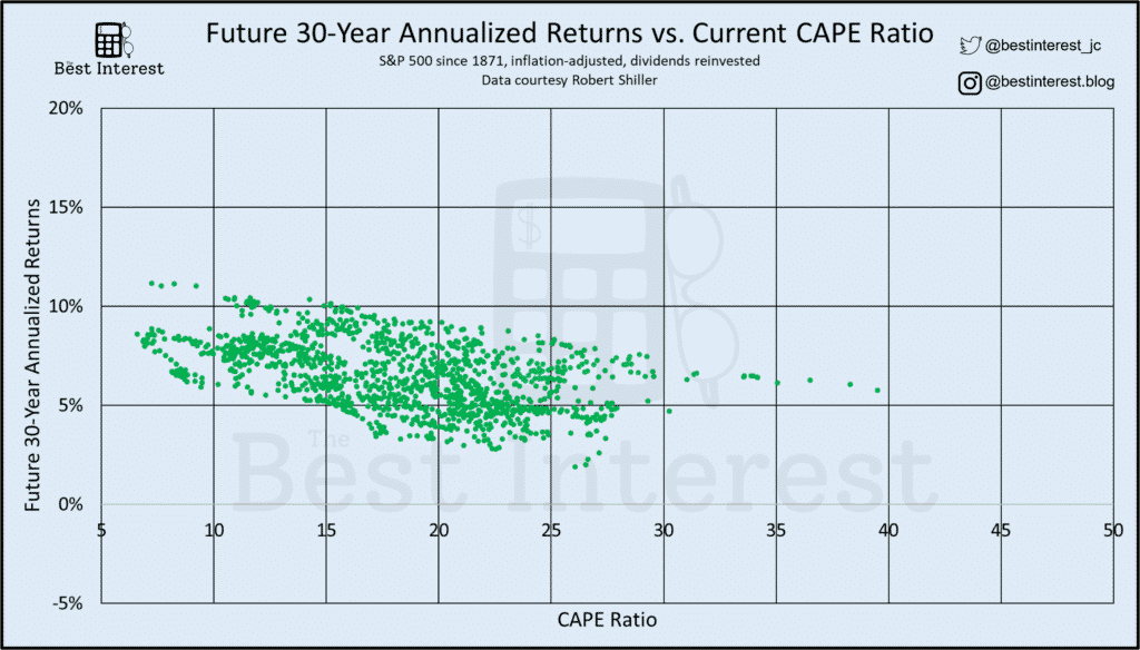
The 30-year data shows the same wonderful trend continuing.
The data is clumped more tightly. More reversion to the mean.
And the “slope” of the data grows even flatter.
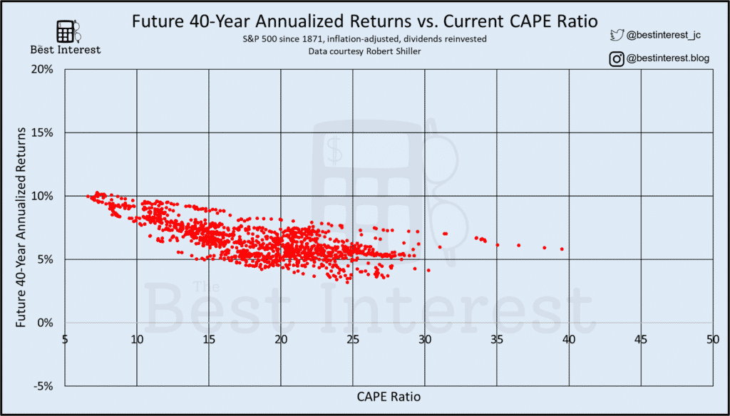
And yet again for the 40-year data.
You may be wondering, “Why is Jesse harping on these two facts? Why is data clumping important? Why is the slope of the plot important?”
What I See In These Plots
We will be covering the basic methods of Divination this year. The first term will be devoted to reading the tea leaves. Next term we shall progress to palmistry. In the summer term, we shall progress to the crystal ball – if we have finished with fire-omens, that is. Unfortunately, classes will be disrupted in February by a nasty bout of flu. I myself will lose my voice. And around Easter, one of our number will leave us forever.
Professor Trelawney, in Harry Potter and the Prisoner of Azkaban
Much like reading the tea leaves, there are different conclusions to be reached from my charts above. My crystal ball is too foggy for precision, but I feel like I can see shapes and shadows swirling in the scattered dots.
“Prediction” #1: The next 10 years might be rough!
I think it’s reasonable to conclude that high CAPEs can signal poor future returns.
Sometimes “poor” has meant 3-5% per year (which is still better than leaving money in cash).
Other times, “poor” has meant a true negative return (which can be worse than leaving money in cash).
“Prediction” #2: But time heals all things.
If you have a multi-decade time horizon…
- if you’re younger than 60
- if you’re older than 60 but your investments have a purpose [charity, inheritance] more than 20 years in the future.
…take hope!
The longer your time horizon, the less the current CAPE should matter.
At 30 and 40 years, nearly all annual returns fall in the 5% to 10% range. Sure, the data is still biased towards low CAPEs.
But we don’t have that option right now! Our stock market CAPE is 34. That’s what the market has given us. So let’s ask, “Does it seem reasonable to invest on a 20+ year time horizon at this elevated starting CAPE level?”
I say yes. It’s reasonable. That’s why I’m still trickling money into my 401(k) and Roth IRA on a regular frequency.
The Argument Against CAPE
I alluded earlier to an argument against using the CAPE ratio like I have today.
That argument is that technology changes everything.
In the era of 20th-century manufacturing, it was expensive for companies to increase their revenue. It required more land, more labor, more assembly lines, etc. The future earnings of any company were tempered by the marginal cost of new profits.
The basic economics of a manufacturing economy kept CAPE ratios hovering in the 15 to 25 range.
But, say the naysayers, the 21st century won’t work that way! The basic economics of technology companies is different.
Software companies have huge gross margins because it’s so simple for them to sell more of their product. They can double their total software licenses with a click of a button. They don’t need more labor, more land, or more intensive capital investments.
That’s why these detractors would say I’ve made a fundamental error: comparing the CAPE in 2022 against the CAPEs of the 1900s is comparing apples to oranges. Thus, they say, our current CAPE of 34 should not be seen as a signal of impending low returns, but instead as a “new normal.”
Are they right? I’m not smart enough to say.
But they’re arguing that I’m being too pessimistic. In other words, my conclusion of “I still plan on investing for the next 20+ years” ought to be even more optimistic than it already is.
I’m ok with that!
Onto the Future
Only time will tell. They may be right. I may be crazy.
But it just may be a lunatic long-term investor you’re looking for.
I think the CAPE/return data is compelling. But it’s impossible to say whether it’s predictive.
In the meantime, I’m going to keep on buying. One decade at a time.
Thank you for reading! Here are three quick notes for you:
First – If you enjoyed this article, join 1000’s of subscribers who read Jesse’s free weekly email, where he send you links to the smartest financial content I find online every week. 100% free, unsubscribe anytime.
Second – Jesse’s podcast “Personal Finance for Long-Term Investors” has grown ~10x over the past couple years, now helping ~10,000 people per month. Tune in and check it out.
Last – Jesse works full-time for a fiduciary wealth management firm in Upstate NY. Jesse and his colleagues help families solve the expensive problems he writes and podcasts about. Schedule a free call with Jesse to see if you’re a good fit for his practice.
We’ll talk to you soon!